Big Data and Nielsen Agree on the Rate of Linear Decline

In my August 27 column, I reported on the biggest shift in US TV audience measurement methodology in history. The panel method has been the basis for currency used in transactions since the dawn of television, not only in the US but in at least 40 other countries. In most other countries, this is still the case. In the US, Nielsen (a consulting client of mine), with clients and MRC on board, and after years of the industry looking at parallel sets of data, switched the currency to panel + BD (big data) this year, as planned and collectively agreed to. Obviously, a handful of people objected to this because getting everyone to 100% agree on anything is impossible, as Abe Lincoln pointed out long before television.
In that article, I showed all of the data needed to prove that the differences between panel and panel + BD were almost always in the under-1% range, and that out of all 174 networks, 15 smaller networks were hard hit, with audience drops relative to their audience size of over 20%. Because these were smaller networks with average ratings around 0.1, this was a loss of only 0.3% of all primetime impressions. But that was no solace to these networks, and in my September 3 column, I recommended methods by which they (and other networks) could increase their audience size.
Certain people who aspire for their company to become a currency replacing Nielsen took advantage of this situation to blow it up to what they deemed to be a “crisis”, and repeatedly insinuated that all networks had lost 20-30% or more of their audience in the switchover.
In the current world climate, in which truth and fiction have become fused in people’s minds, these extremist claims flooded the zone.
Other people infected by these fictions stood up and presented data and interpreted it along the same lines. One gent presented two lines that were definitely strongly correlated with one another. One was the Nielsen panel, and the other was the Nielsen panel + BD. Both were trending downward to exactly the same degree – both represented linear TV over time – and even the little jiggles up and down were synchronized between the two lines. He interpreted this to mean that Nielsen had cooked the numbers so that it would look like big data had validated what he called “the ailing panel”.
An alternate interpretation could have been that the two sets of data, by agreeing that strongly, were likely to be measuring the same actual phenomenon correctly.
He presented a slide showing the many ways that Nielsen corrects big data, including filling in gaps in coverage of programs by smart TV; adding streaming which is missing from all big data and is the largest single component of all TV viewing in the world today; using data from devices that are both in the panel and in big data to find errors in big data (often from human error combining program schedules with set top box data); etc.
He pointed to that list on the slide and said that this was the “black box” hiding Nielsen’s fixing the numbers to come out the way they wanted.
He asserted that he had looked at all the sources of big data he could find and that none of them supported the degree of downward decline in linear TV that Nielsen had found in its latest panel + BD work.
Strangely, he did not show the slide with the big data that showed slower decline rates.
I asked Nielsen to give me the raw big data which they receive so I could see for myself whether that big data showed slower declines than reported by the new currency. Here’s what it looks like:
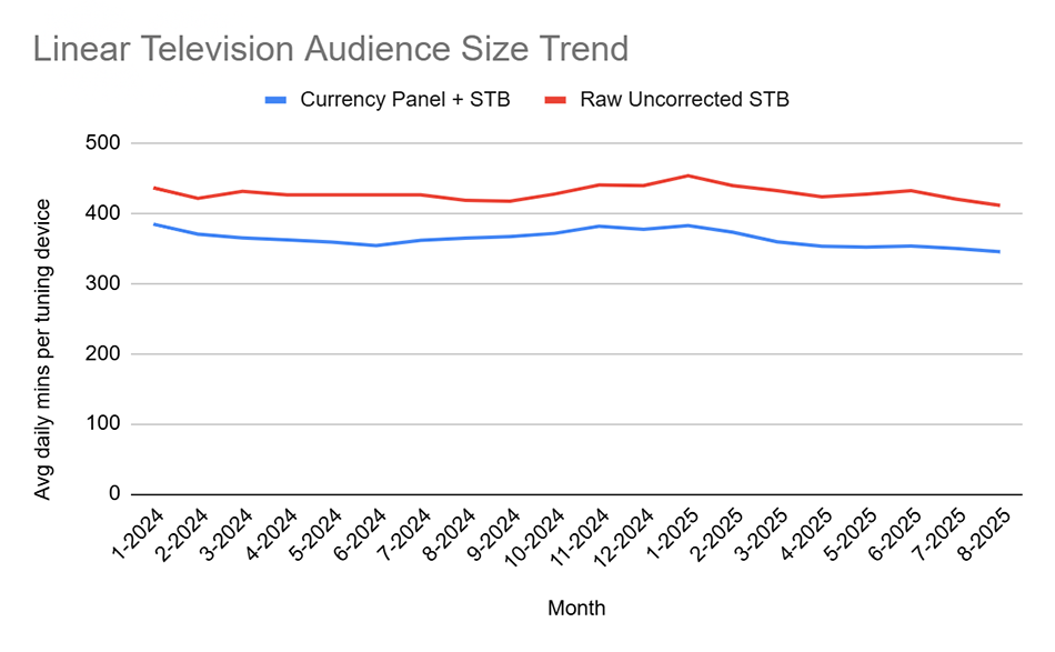
The two trends are highly correlated with one another. The allegation that the panel + BD is plummeting downward at a faster rate than the raw big data are disproven. The allegation that no one can find big data that verifies currency are disproven.
Please note that the gentleman showing the slides also proved the title of this article, except he had a different explanation for why this happened.
Technical Notes
No Nielsen edits have been made to the raw big data shown in the graph, even in cases where the set-top box shows the channel being switched away from before it is switched to. The one thing Nielsen had to do in order to make the set-top box data look like data at all was to apply the Set On/ Set Off algorithm. This is what I called the False Positives Algorithm when I invented it in the 90s – Nielsen uses a far more advanced version of what I invented, mine was a rule by which all data were edited out after a period of X hours after the last clickstream signal of any kind (channel change, sound volume change, etc.) except during extreme long duration programming like certain sports, Olympics, etc.
Here is a graph from TRA’s ARF Research Review, which shows what set-top box data look like if you do not apply any such rule. The red line is what you get if you do not apply some On-Off formula, and that would not be at all useful for helping the industry get its mind around this debate.
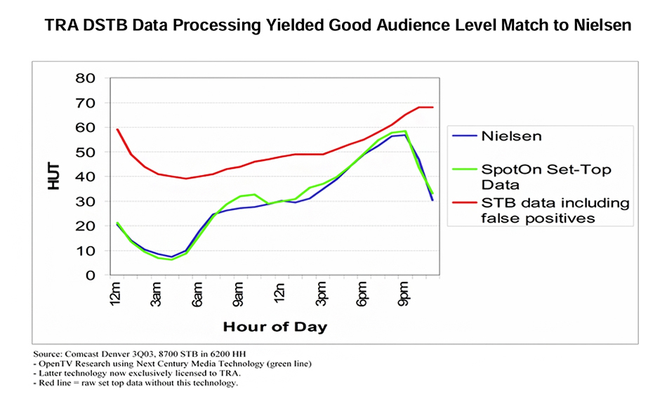
For clarity of evidence, smart TV data are not included in this comparison, because the raw, uncorrected ACR data represent only 1.1 TV sets within the average household and only a portion of all the programming. There would be no point in presenting raw, uncorrected smart TV data because it ought not to be considered a proxy truth standard under any conditions, because of its incompleteness in terms of TV sets within households and in terms of programming coverage.
Posted at MediaVillage through the Thought Leadership self-publishing platform.
Click the social buttons to share this story with colleagues and friends.
The opinions expressed here are the author's views and do not necessarily represent the views of MediaVillage.org/MyersBizNet.

Bill Harvey
Bill Harvey, who won an Emmy® Award in 2022 for his invention of set top box data, has spent over 35 years leading the way in media research with pioneer thinking in New Media, set top box data, optimizers, measurement standards, privacy standards, the A…