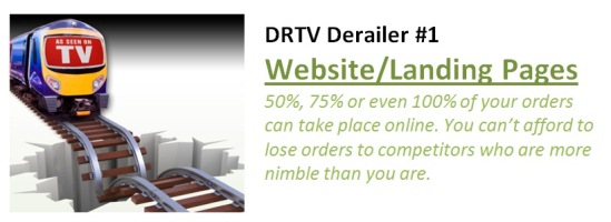
After reviewing hundreds of landing pages, web sites and micro-sites for DRTV products over the years, I've concluded that there's nothing as important as having a well-designed site that converts. I've seen too many sites that:
* Look nothing like the short-form or infomercial
* Have poor navigation
* Have a lot of useless information
* Present the consumer with numerous links that are not necessary
* Don't have the ability to play the original short-form or show
* Don't have testimonials or not prominently displayed
* Bury the offer instead of making it prominent
* Don't have a graphic call-to-action
* Use the word "submit" in a button instead of something more descriptive
* Have inconsistent information (see #3), such as a different price or offer than is featured in the commercial
* Have a poorly designed shopping cart (see #2)
* And on and on and on
These basic errors lead me to conclude that site design in many cases is merely an afterthought as opposed to deserving the same kind of attention that the production of the commercial gets.
To see why this is so important, do the math. Shopping cart abandonment, where online customers get into the cart and then leave, accounts for 70% or more of lost customers. Add in bad site design and other common errors, and you could be losing 90% of consumers who you've spent cold cash to get to your site in the first place.
You should be able to get stats from your webmaster or IT people and determine how many consumers arrive at your site on a monthly basis. Imagine that 90% of them leave without purchasing. Imagine if you could prevent just 10% of them from leaving – wouldn't that add significant dollars to your bottom line?
In the same way you create a Marketing Blueprint and/or Creative Brief to design your infomercial, follow a similar best-practices process for creating your web site or landing page. Spend the time to review dozens of landing pages for successful DRTV products as I have. You'll see some that are very well-designed, ones you can emulate. Benchmark traffic and conversion rates for your current site, so you can see how a revised site will enhance conversion.
Specifically, here are some suggestions based on the list of common errors presented on the previous page:
* Your site should have the same look and feel as your commercial, with similar graphics, so that consumers will feel comfortable that they are on the right site and that there is consistency between the commercial and the site.
* You don't need much navigation. We pioneered micro-sites in 1996 and found that having the entire site on one to five pages is all you need. I've seen numerous sites where the complete site is just one page, including all the order information and form. In this case, less is more.
* Look at every piece of text and graphic on your site, and ask yourself, "is this really necessary…is it helping to convert window shoppers?" You only need to present information that aids in the conversion process.
* Remove all links that don't contribute to the conversion process. You don't need to provide "resources" that will distract the consumer from doing the one thing that you want them to do: buy.
* You MUST have the ability to play the original spot or long-form, either automatically when the page loads or clickable by the consumer. There are numerous reasons for doing this: the consumer only saw a small percentage of the show; he/she wants to show it to a family member; they want to see a specific part again; and so forth.
* In the same way that authentic testimonials are the backbone of your short- or long-form, they need to be present on your site. You can put 3-5 of the best ones on the initial landing page, and then give visitors the ability to see more on a secondary page. Same with positive press you've received, awards, endorsements and other "warm and fuzzy" third-party comments.
* You've taken the time and effort to create a compelling offer, so make sure it's prominent on your site. Don't bury it. We all know how important the offer is from decades in the DRTV business, so don't relegate it to an unimportant position on your site.
* Your call-to-action should be a bold and prominent button. It should be repeated at least two times; place one of them above the fold.
* Don't use the word "submit" as your CTA graphic. It's a techy term that means nothing to most people. It's easy to come up with something much better, such as "Send it to me today!" or "Buy Now" or "Click for Free Shipping." You get the point.
* Make sure you have several people proof your web site, comparing it against information in the commercial. You can't afford to lose customers because of a different price, different offer, and missing or incomplete information.
* Make sure your shopping cart is simple and has as few steps as possible, and addresses the common reasons for abandonment.
You can download the entire ebook at any time at:http://DD111.acquirgy.net
Irv Brechner has written over 100 published direct marketing articles and 13 books on a variety of topics. He's been a pioneer in online customer acquisition since 1996 and offline for his 35-year career. He has developed Acquirgy.com's "Customer Acquisition Intel Center" (acquirgy.com/intel ) he evangelizes best-of-breed tactics to help companies acquire customers in the digital age. He can be reached at: irv@acquirgy.com .
Read all Irv's MediaBizBloggers commentaries at Customer Acquisition Intel.
Check us out on Facebook at MediaBizBloggers.com