InteracTiVoty - Designing for TV: Keep It Simple - Margret Schmidt - MediaBizBlogger

We've all experienced poorly designed DVD menus: you can't tell which item is highlighted; where you are going to end up if you press an arrow key or select; and don't get me started on the annoying looping video and extra-loud sound. The most important thing we can all do to grow interactive TV is to make sure we don't fall into the same traps.
Here are some principles to guide you in your design of interactive content for television:
Dark backgrounds, light text
While readability on the web is best with a white background and dark text, TV is exactly the opposite. The best readability is achieved with a dark background and white text. This can be a challenge when you are translating your web designs into interactive TV designs, but it is a very important step. Pull out your brand style-guide and find the rarely-used version of your logo designed for dark backgrounds – typically it calls for the logo in white on a background of one of your brand colors, or it specifies the use of a glow or border around your logo. Next, take the darkest and most characteristic colors from your logo and make them your rich, dark, background. Be sure to give the background depth. Flat works well online, but think about how networks use more of a 3D effect on their overlays. Remember, this is video, and needs to feel like it. A subtle animated background is ideal, because it makes the app feel "alive" without being distracting. White is the best color for text (but not a pure white, which is too hot for NTSC, use #EBEBEB). Yellow is the second best choice, but you'll need to use a larger font size than you would for white to achieve the same level of readability.
Make it comfortable
We have plenty of debates about the size of TVs, how far away people sit when viewing them, and typical corrected and uncorrected vision, but at some point it doesn't matter. While you might hope that people follow the formula and sit no more than 10 feet away from their 42" HDTV and wear glasses if their eyesight is worse than 20/40, you can't guarantee it. So make your fonts bigger, have fewer items on the screen, and leave lots of whitespace. You want all users to find it comfortable to use your app. On a standard def TV I recommend no more than 10 lines of text on the screen (including the title). On a high def TV, I wouldn't push it past 12. Beyond that, there is just too much going on. (In usability terms we refer to this as "cognitive overload.")
Don't forget the "safe" areas
When you design for web, you worry about the people with small monitors and lower resolutions, because you don't want them to have to scroll to see your content. On TV, the display area is a fixed resolution, but not all TVs display all of it. In TV design there are two important regions of the screen: "action-safe" and "title-safe." On a standard def TV, while your screen resolution is 640x480, you want to keep all images within the action-safe region of 578x434, and all text within the title-safe region of 520x390. Many TVs don't show the area outside of action-safe at all, and there can be some distortion in the area outside of title-safe in TVs that aren't flat screen. You would think that HDTVs would have stricter standards and that you could expect all TVs to display the full 1280x720 pixels in 720p. Unfortunately, no. In our tests we found we could only count on the inner 1120x610 to be visible (which we defined as title-safe). We only allow images out to 1170x675, knowing that many TVs clipped the area beyond that. Be sure to keep your text and images inside the safe region, but bleed your background out to the full resolution.
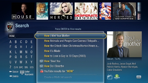
Make selectable items obvious
Where most DVD menus fail is getting too creative in their treatment of selectable items and the highlight. Think of the DVD menus when there are just two items on the screen, "Play movie" and "Bonus features," and each is a different color. Which one am I on? What will happen if I press select? These experiences frustrate users.
The keys to making the selectable items obvious are:
*Organize your options in a grid, and not haphazardly across the screen. It should be clear where your highlight will go when you press right or up.
*Make sure all the text is clearly visible over the background and there isn't interference between a light area of the background and the white text on top of it.
*Give the highlight more shape, and don't just rely on a difference in text color or a subtle arrow to make it clear to users where they are.
Elevate the most common tasks
The key to a successful interactive app is that it feels easy, effortless, and has a good payoff. If users are drawn in for one or two features, make sure they are at the top of the menu. Don't bury your most popular content hoping they'll wade through your other messaging to get to it. Don't think they'll be willing to work to get what they want. It is easy enough for them to hit the menu button and forget about you entirely. If users get what they are looking for quickly, they are more likely to spend time in your app exploring the other features you have to offer.
Embrace the standards of the platform
Users will be most comfortable with your interactive content if it behaves like other areas of the UI on the platform they are using. On TiVo DVRs this means respecting the behaviors of up/down/left/right/select. Left from the main screen of your interactive app should return them the previous screen. Menus and lists should be displayed vertically, and pressing select should slide the new screen on from the right. (This is how our users come to learn that left gets them back.) If you use some of the standard elements for the platform, like the highlight treatment and sound effects, your users will feel more comfortable. The more comfortable they are, the more likely they will return to your app or try out a new app. It only takes a few bad experiences with interactive TV apps before users feel so burned out they avoid clicking on any in the future.
Remember, it's all about entertainment
The official mantras from the days when TiVo was first being designed included "It's entertainment, stupid," "It's TV, stupid," and "It's video, dammit." And while they were certainly rude, they did constantly reinforce the need to embrace TV as the medium. It is just not the same as designing for the computer. Remember, your user is leaning back on the couch, ten feet away from the screen, and wants to relax and be entertained. Let them watch videos, and don't expect them to read any more than a paragraph of text. If you want to give them more in-depth info, then offer to send it to them via email. (The platform should have their email address on file, so they shouldn't need to type anything in.) Typing on TV should be avoided at all costs. If you have something they can purchase, make it available through an account they have already set up. With an Amazon account and their 5-digit PIN, TiVo users can add Amazon items to their shopping cart or select 1-Click and have it shipped immediately. No keyboard needed.
At TiVo we believe "less is more" and by keeping to the simplicity of our UI standards, the content stands out, and the interaction doesn't get in the way.
Margret Schmidt is VP, User Experience Design & Research for TiVo Inc. Follow her at http://twitter.com/tivogrrl

Margret Schmidt
Margret Schmidt is Vice President of User Experience at TiVo. In such capacity she serves in the role of chief design officer, responsible for TiVo's TV, PC, Mac, Web, and mobile experiences. Her team works across all divisions of the company — ensurin…