Is Big Fusion of Big Data Back to Small Data, Good Enough? - Bill Harvey
In our previous post we began with the idea that Nielsen appears to be moving in the direction of more fusion as a general way to preserve shareholder value and the smoothish trend line of the industry’s key transaction basis numbers. This means that Big Naturally Occurring Census Data (BNOCD) will be conformed to small-panel data and will continue to look a lot like the data of the past half century. We promised to address the question of “Is That Good Enough?” in this post.
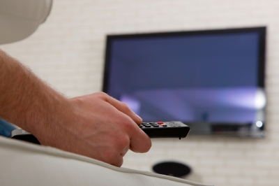
Let’s leave aside the question of how good the new measurements of the small screens are. They perhaps might never in our lifetimes garner more than half the audience. (Or we could be surprised! However let’s continue with the more conservative change assumption.) Displacing the large TV screen means getting the entire human race up off its tired derriere at night. This implies a new economic order, and mental/emotional changes. Forecasting the small screens to be over half the audience in our lifetimes would be Pollyannaish given the slow rate of change — the larger the impact, the slower the change can occur — simple math really, but let’s leave that for another blog. (We do not preclude the possibility of a disruption that could obliterate the logic in this paragraph. The probability of small screen dominance in our lifetimes may be small, but not zero.)
 Let’s instead focus on the big TV screen. How good are the measurements we use as currency today? These methodologies are not slated to change in our lifetimes given the present equilibrium of forces. The core method is to stay the same. Around that core, the 33 other Nielsen panels will cluster, with some small-sample cross-screen singlesource, and major emphasis on fusion, which will combine all Nielsen samples into one output file. It will be as if each panelist in any one panel had given all of the information asked/measured across all silos.
 JOIN MEDIA VILLAGE, THE NEW SOCIAL KNOWLEDGE NETWORK FROM MYERS MEDIA BUSINESS NETWORK. CLICK HERE TO JOIN!
So how good is the core method — the in-home static placement peoplemeter? Let’s review the evidence — some of it for set tuning meters and some of it for pushbutton peoplemeters. Both types of TV meter have Nonresponse Bias, expected to be worse in the P-Meter because work is involved so response will be lower. Of the two, only the P-Meter has Response Bias, i.e. people cannot be expected to be 100% compliant with button pushing. So for two good reasons, the set tuning meter — as Gale Metzger has taught the industry — is expected to be more accurate than the P-Meter. Anything wrong with the set tuning meter method then is a signal that the same thing is probably true to a greater degree in the P-Meter.
In the first half of the 60s, driven by Congress (the Harris Committee hearings) a large Nonresponse study was done by CONTAM (the broadcast networks and NAB). The only released finding was that Nielsen’s set tuning meter panel produced inflated estimates of TV tuning — but the level of inflation was an average of only 10% so it was deemed acceptable.
The inflation was correctly attributed to Nonresponse Bias. This means that the homes refusing the meter were different from those accepting the meter. One characteristic of the refusers was that they watched less TV, thus they didn’t think they were needed in the panel and/or didn’t care enough about TV to want to keep their favorite shows on the air. Even though there would be no human effort on their part, as this was before pushbutton peoplemeters, a significant chunk of the original predesignated sample said no, even at the time. Nielsen’s response rate at the time was higher than it is today — perhaps twice as high — so the degree of Nonresponse Bias has probably gone up. However, recent studies by the Council on Research Excellence (CRE) suggest that Nonresponse Bias remains tolerable in its effects on the National Nielsen Peoplemeter panel.
Today there are even more reasons to not want to be in the Nielsen TV panel. You have to push buttons every time you go in and out of the room (theoretically). This is an enormous difference. It changes the nature of the panel dramatically from that of a set tuning meter panel. A set tuning meter panel is far better than a pushbutton peoplemeter panel — as Gale Metzger has observed — because it has lower Nonresponse Bias, and zero Response Bias.
Of course, if one wants person-level information, the choice then becomes Peoplemeters vs. Set Tuning Meters + Diaries, and Peoplemeters win. Gale Metzger’s point was that one could have two panels, one with set tuning meters on which the household ratings would be based, and a peoplemeter panel whose viewers per viewing home per airing would be conformed to the set tuning meter panel. This would be better than what we have now, but it would also be costlier, and nobody outside Nielsen wants Nielsen costs to go up any faster than they do anyway. So the Metzger idea has never been implemented — yet, anyway. It is worth including in our considerations about future options, now that the changes have become so significant that we cannot just assume that small adjustments in methodology are the only course worth consideration.
The pushbutton peoplemeter has Response Bias, meaning that people do not always have the buttons in the position that reflects reality. Sometimes a second viewer wanders in without pushing his/her button. There are screen prompts that force the first viewer to log in or have their viewing interrupted. This does not apply to additional viewers. BBM, the industry nonprofit that measures electronic media as currency in Canada, did an ARF award-winning study a few years ago using the passive Arbitron PPM and comparing its results to pushbutton peoplemeters in the same homes. There was close agreement on the first viewer but seriously lower reporting of secondary viewers in the pushbutton method.
Nielsen’s own validation study shows only about a 10% overall error rate in the position of buttons on the pushbutton peoplemeter. However, this is based on telephone calling to the foxes that are guarding the henhouse and asking them to tattle on themselves. If the panelists in effect find themselves holding a smoking gun when called, and admit to button noncompliance at that moment, which calculates as about 10% error, one can be sure it is higher.
The finding of 10% Nonresponse Error in the 60s when the overall response rate was higher, and at least 10% Response Error, gives one an unsettling feeling about what the size of the total error might really be today. In the next post, we’ll look at some real data that help answer that question. See you here!
Click here to read genConnect’s interview with Jack Myers on dual mentorship in cross-generational workplaces
Bill Harvey is a well-known media researcher and inventor who co-founded TRA, Inc. and is its Strategic Advisor. His nonprofit Human Effectiveness Institute runs his weekly blog on consciousness optimization. Bill can be contacted at bill@billharveyconsulting.com
Read all Bill’s MediaBizBloggers commentaries at In Terms of ROI.
Check us out on Facebook at MediaBizBloggers.com
Follow our Twitter updates @MediaBizBlogger
The opinions and points of view expressed in this commentary are exclusively the views of the author and do not necessarily represent the views of MediaBizBloggers.com management or associated bloggers. MediaBizBloggers is an open thought leadership platform and readers may share their comments and opinions in response to all commentaries.

Bill Harvey
Bill Harvey, who won an Emmy® Award in 2022 for his invention of set top box data, has spent over 35 years leading the way in media research with pioneer thinking in New Media, set top box data, optimizers, measurement standards, privacy standards, the A…